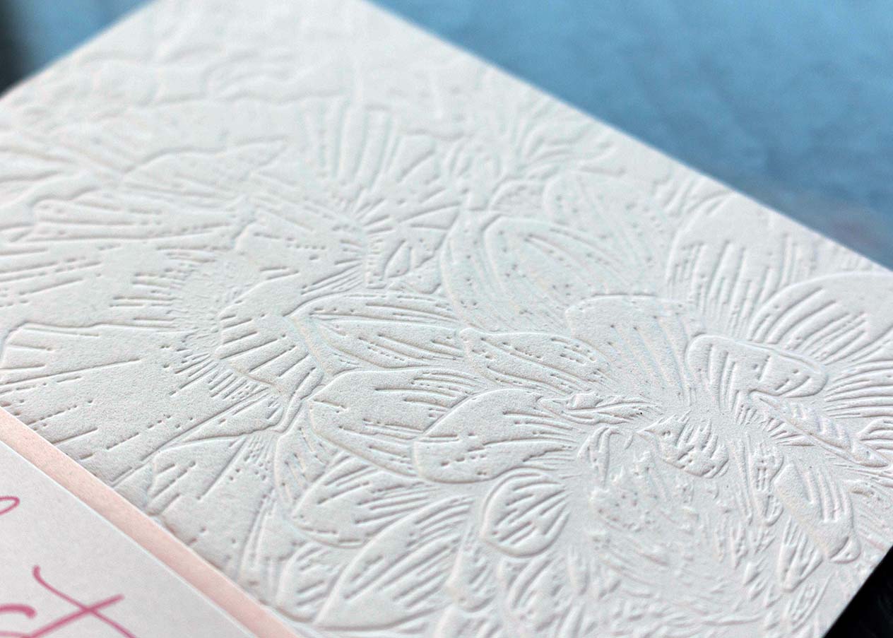
Blind Debossing Makes an Impression Without Ink
To Ink or Not To Ink? That, sometimes, is the question. Today, we’re going to get into the
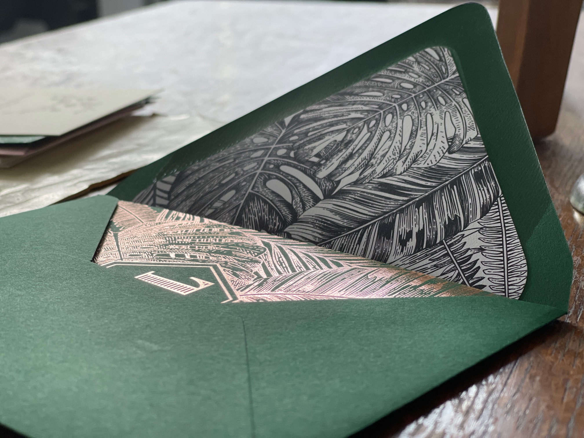
All About Wedding Invitation Envelopes
Did you ever stop to think that the envelope is your guest’s first glimpse of the wedding invitation?
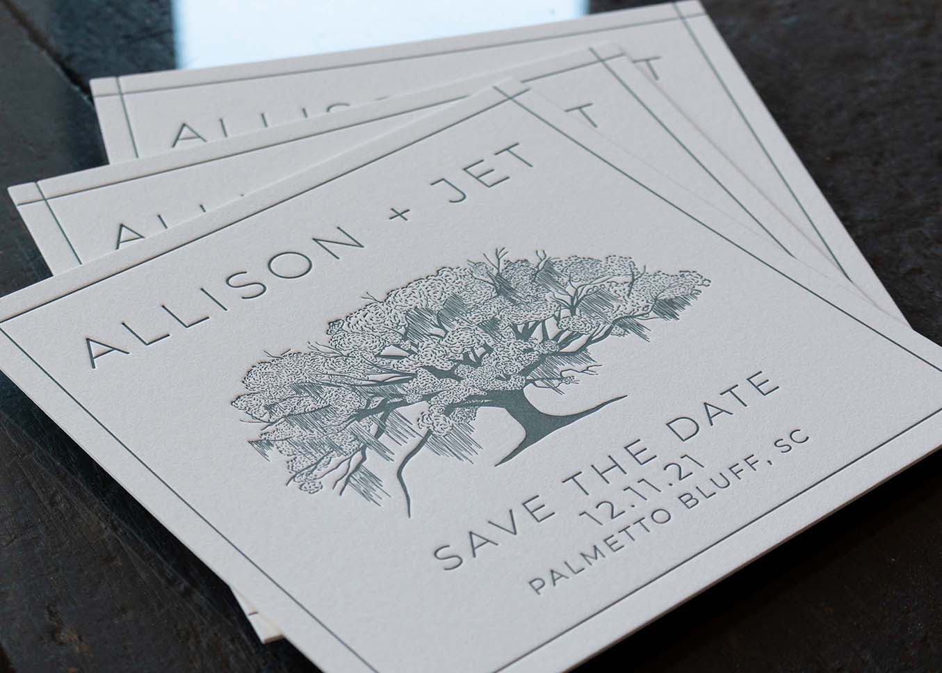
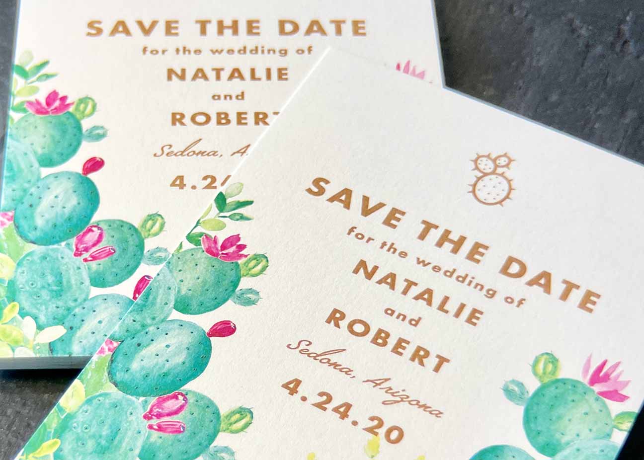
Letterpress Save The Date Ideas
Yay! You’re engaged and this is such an exciting time. Planning your wedding is a huge deal and
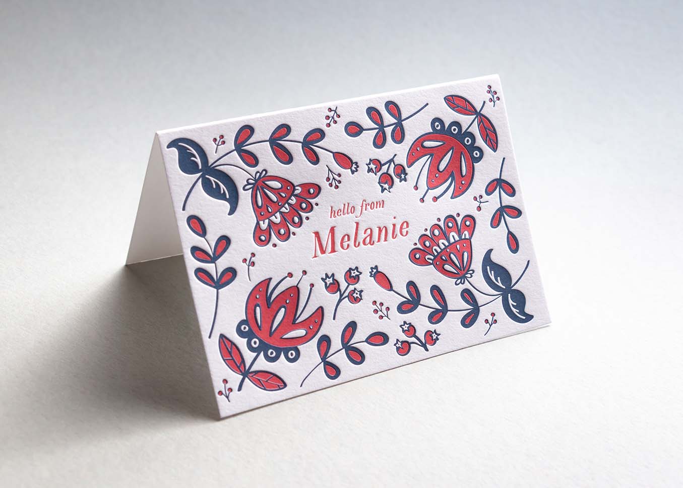
Using Letterpress Note Cards to Enhance Your Snail Mail
Do you remember a time, not too long ago, when snail mail was de rigueur? Before emails and
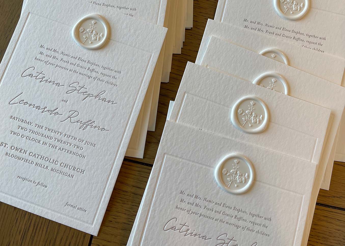
Catrina and Leonardo’s Textural and Modern Letterpress Wedding Invitations
Hi! My name is Alyssa, founder and stationery designer at Alyssa Amez Design. Alyssa Amez Design is a
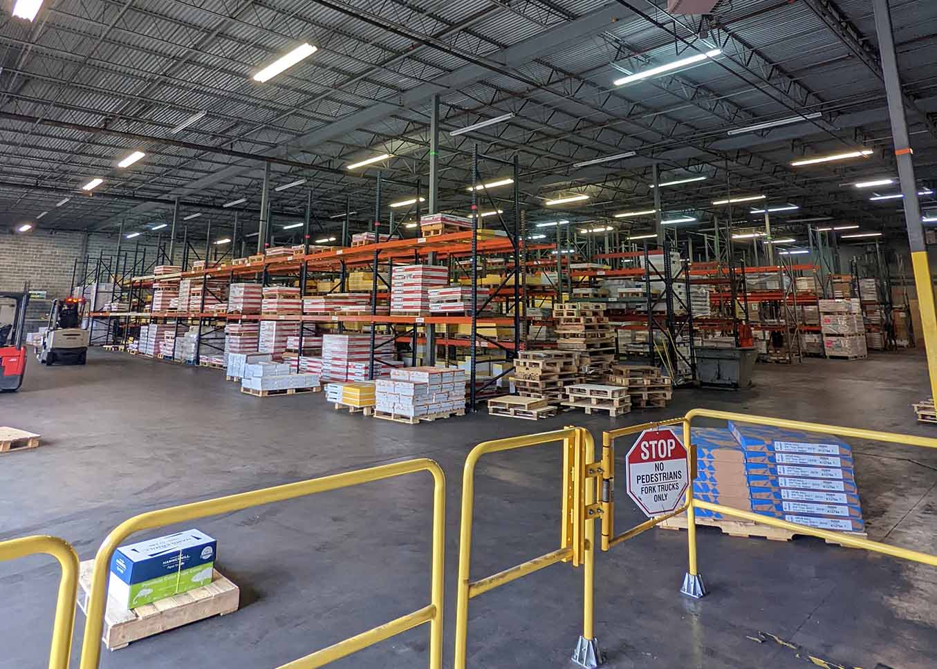
Joining Our Wholesale Program
Wholesale Letterpress Printing for industry professionals As a craft print shop, we often get asked, “Will you print
How Letterpress Printing Can Enhance Your Wedding Invitation Suite
When deciding on the tone and feel of your wedding, the stationery is something that deserves just as
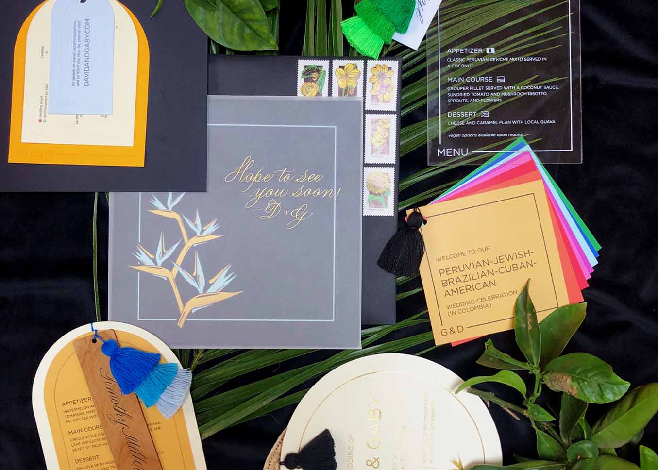
Gaby and David’s Colombia Destination Wedding
Hi there! Meryl at Jubilee Paper here with a guest blog post featuring a truly epic invitation suite
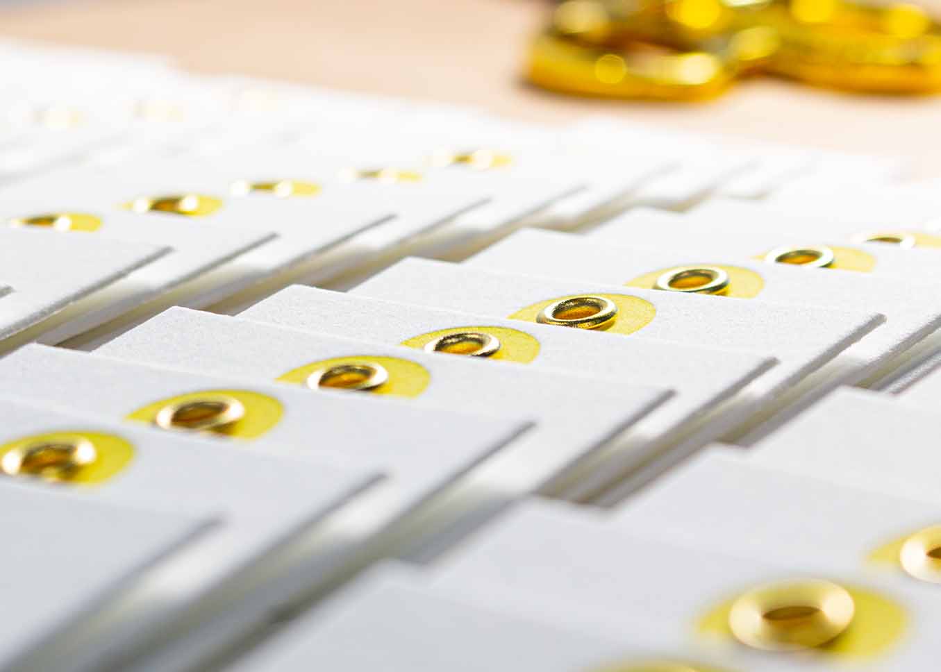
The Triumphant Rise of the Humble Hang Tag
A look into the past and present of hang tags and how you can create letterpress hang tags
Young, Scrappy, and Hungry
January is here and with it comes the standard resolutions for reflection, growth, change, and a plan. As
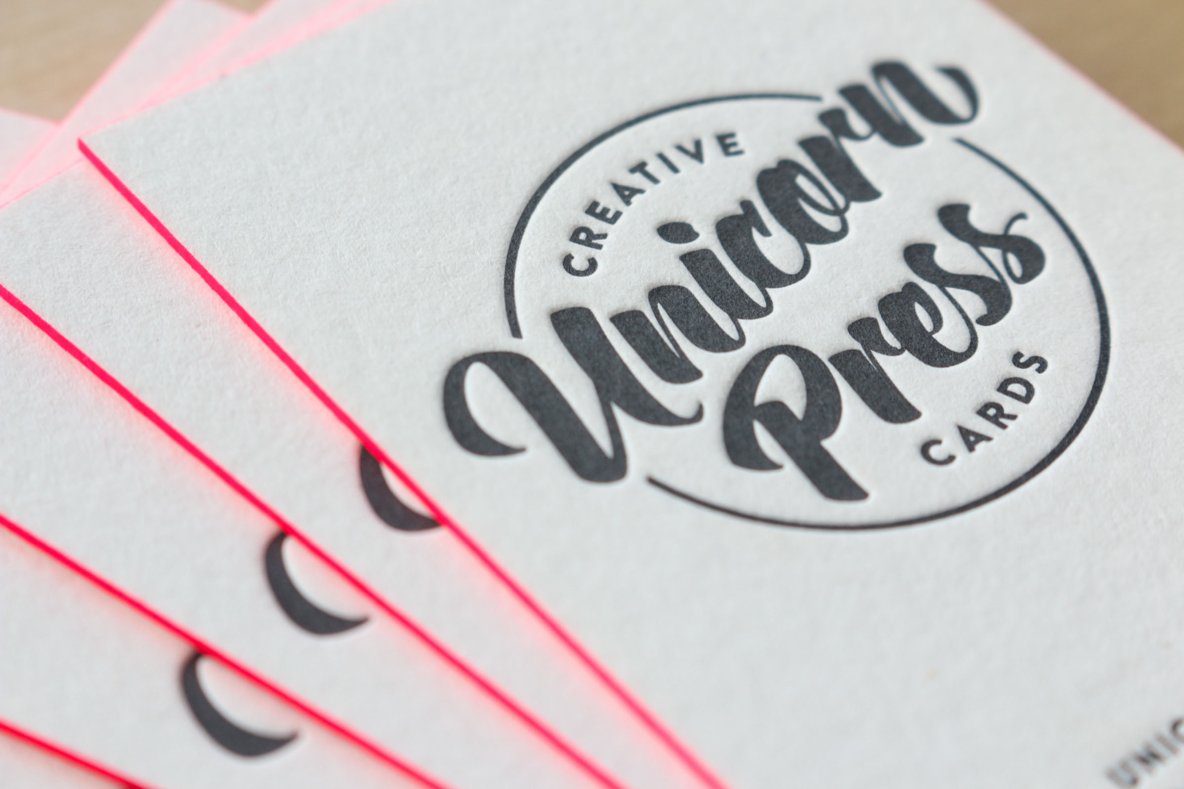
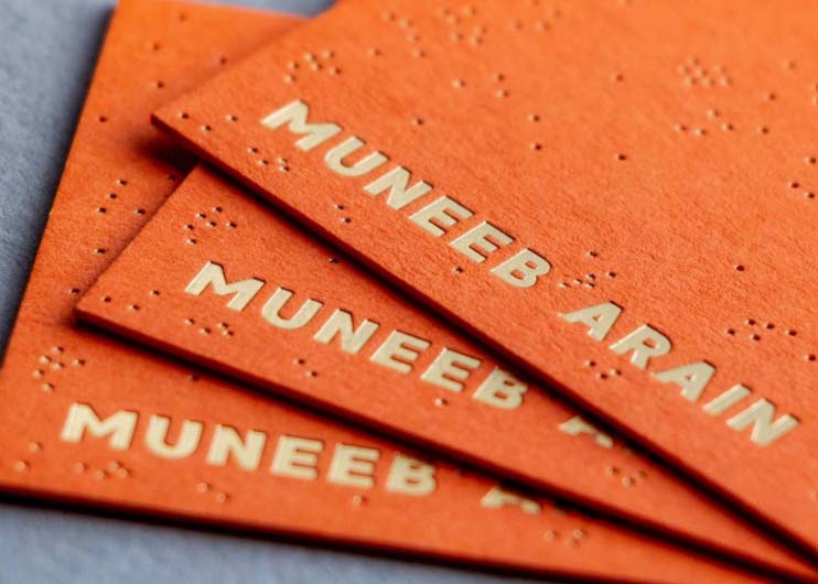
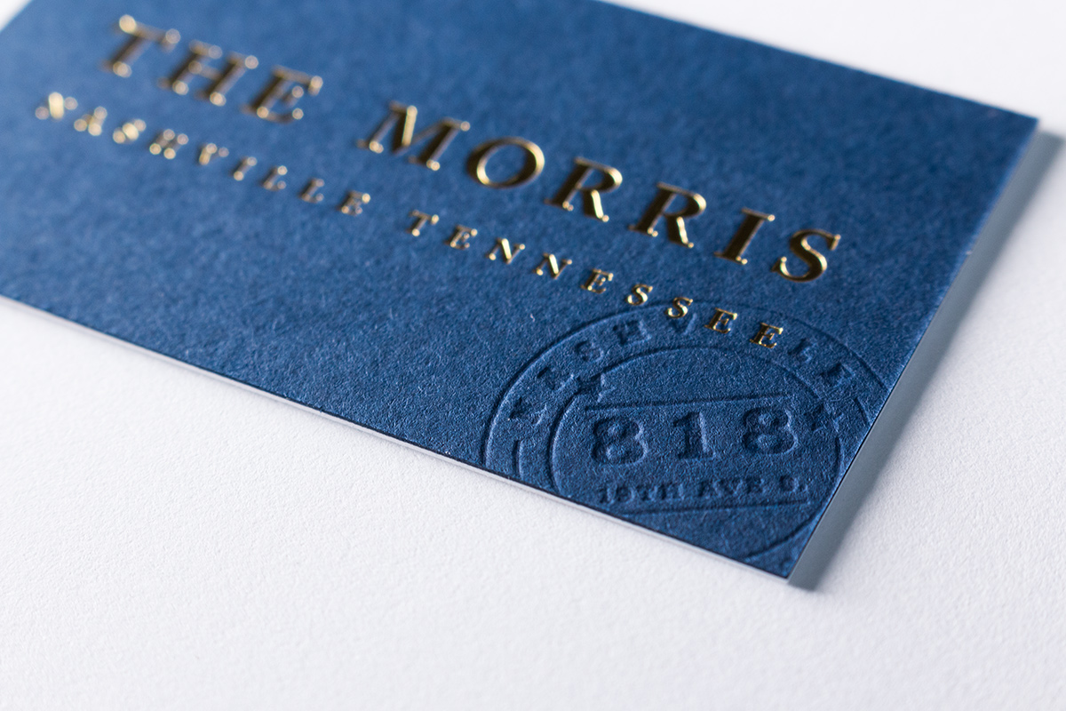
Letterpress Business Card Ideas
Most people come across business cards on a daily basis. They’re often given out by salespeople, they’re on
Letterpress Ideas For Business Stationery
While some people see winter as a slow season, one for reflection and rest, we see it as an opportunity to plant the seeds of growth for next year.
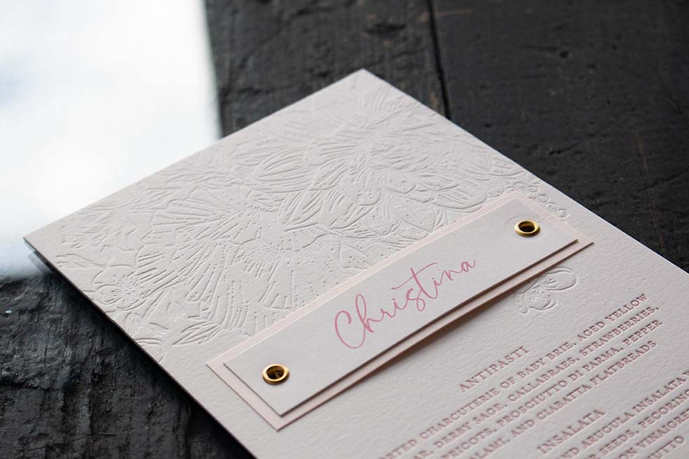
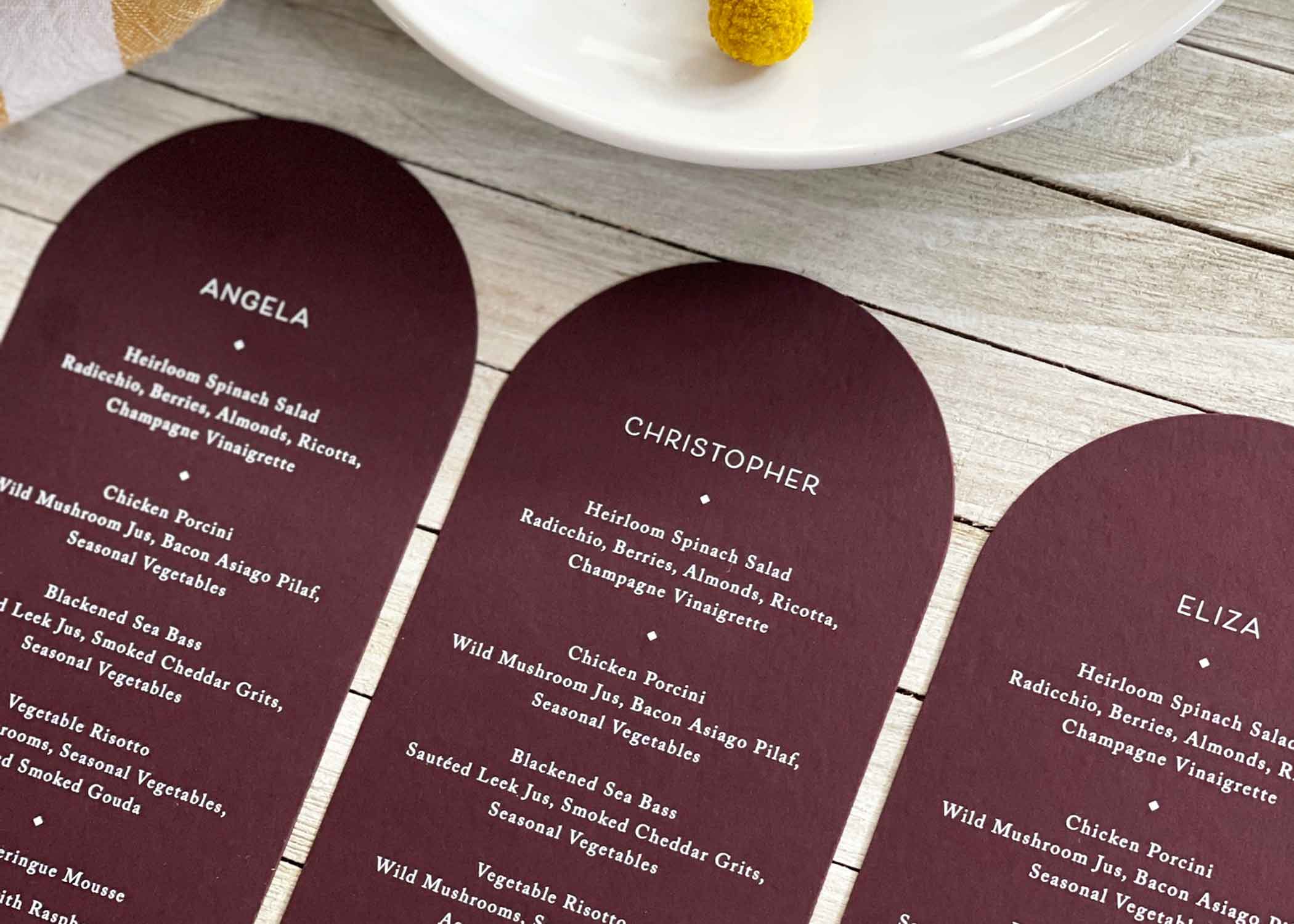
On the Menu: A Deep Floral Texture
When it comes to day-of stationery, the menu card is too often an afterthought. We think that should
When to send wedding invitations
One of the most important things to consider when working on a wedding planning schedule is timing. Planning
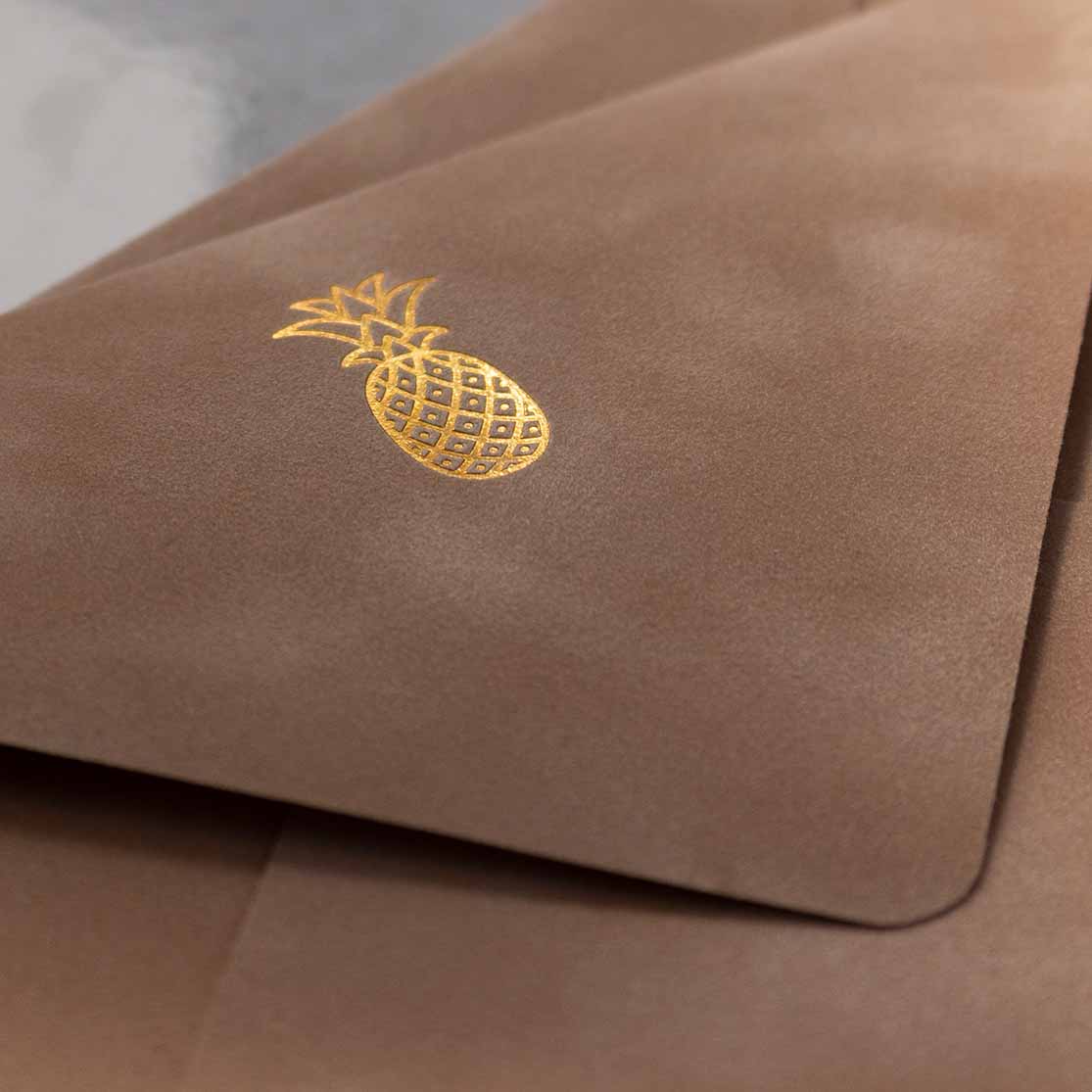
Velvet Envelopes
Our clients know that we love experimenting with new techniques and materials, so when a stationer we work
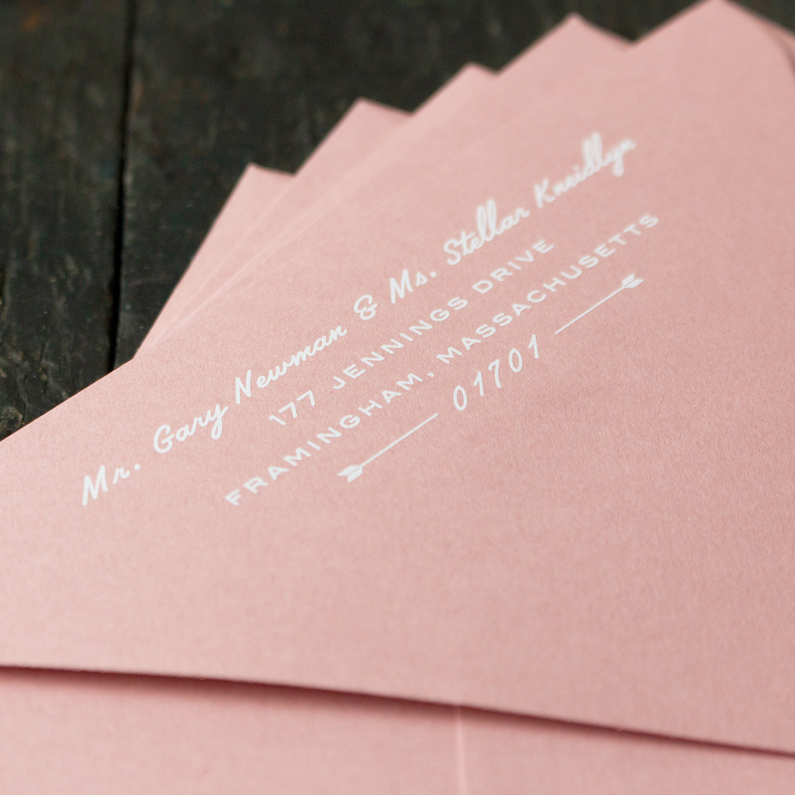
White Ink Envelope Printing
Colored envelopes are one of the biggest trends in stationery right now. Deep jewel tones like amethyst and
Blind Deboss Printing
One of the printing techniques we enjoy using the most is the blind deboss, which simply means a
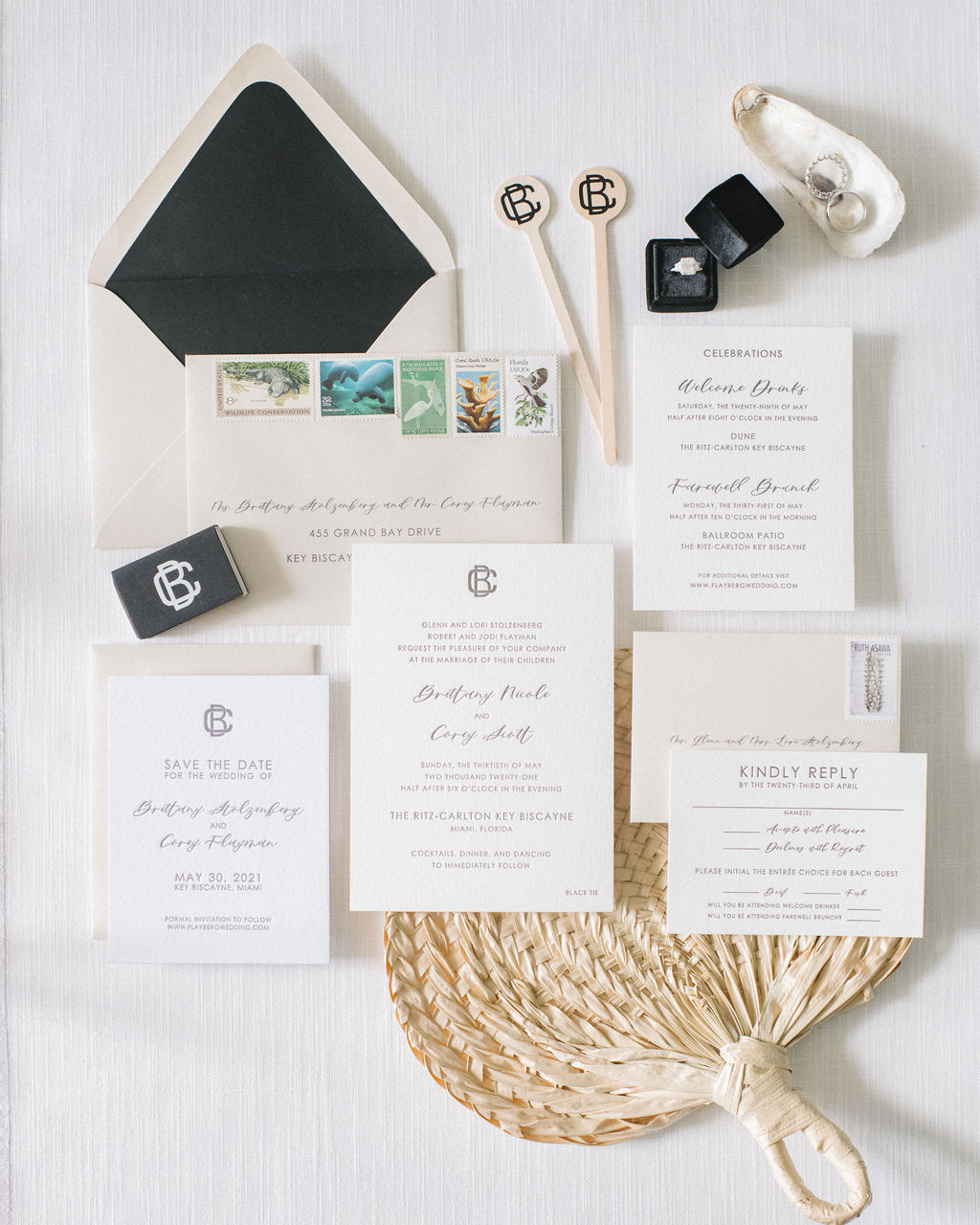
Flayberg Wedding
It is always a special moment to receive a beautiful photograph of an invitation suite we helped to
White Ink Printing
We got into the printing business because of a fascination with the letterpress process. The vintage presses, ink
